The Outdated Sofa Colors Everyone Regrets and the Smarter Picks Replacing Them

Table of Contents
Your sofa color is telling on you. That cool gray sectional you bought in 2019? Dead giveaway you haven’t updated your design thinking since before the world changed. The stark white couch you’re constantly protecting from actual living? Classic anxiety furniture. And that millennial pink piece you thought was so clever? It’s screaming, “I peaked during the first Instagram era,” to every designer who walks through your door. The furniture world is experiencing its biggest color revolution in decades, and if you’re still clinging to these six specific shades, you’re broadcasting exactly when you stopped paying attention.
Here’s what’s actually happening: designers aren’t just swapping colors for the sake of trends. They’re responding to hard data about how certain colors mess with our brains, our sleep, and even our heating bills. The mass exodus from specific shades isn’t about fashion. It’s about furniture colors that were literally making us feel worse in our own homes. Once you understand what’s driving these changes, you’ll never look at a furniture showroom the same way.
The shift is so dramatic that major brands are scrambling to clear inventory of colors that were bestsellers just three years ago. Return rates for certain shades have jumped over 300%. People are dumping practically new sofas because they have finally realized why they never felt comfortable in their own living rooms. And the science behind these failures? It’s fascinating and slightly terrifying.
What Smart Designers Are Actually Choosing Now
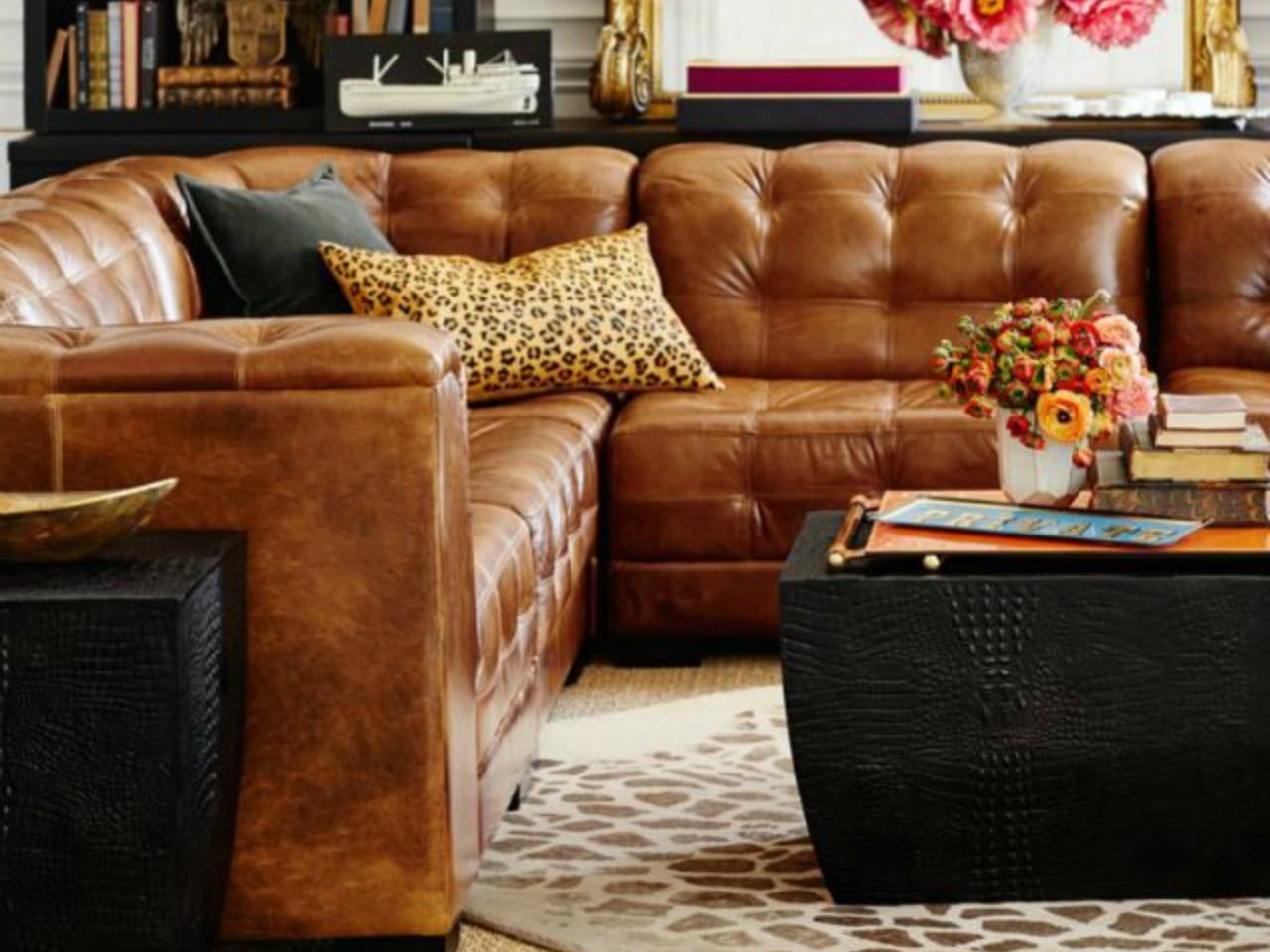
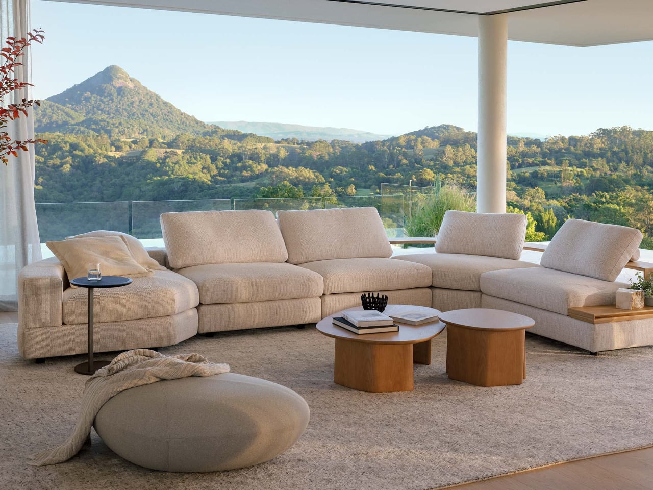
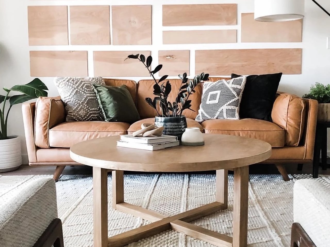
Let me be crystal clear about what’s happening in design studios right now. Designers are picking warm neutrals like their careers depend on it (because they do). Cognac leather, warm tan, buttery caramel, soft wheat, and rich oatmeal dominate every mood board I’ve seen lately. These aren’t boring beige retreads. They’re sophisticated colors with yellow and red undertones that actually work with human biology instead of against it.

Earth tones are having their biggest moment since the 1970s, but this time with science backing them up. Terracotta, rust, clay, and adobe aren’t just pretty; they trigger parasympathetic nervous system responses that promote actual relaxation. Designers are specifying these colors because they’ve seen the data: clients report better sleep, lower stress, and higher satisfaction rates with earth-toned furniture than any other palette.
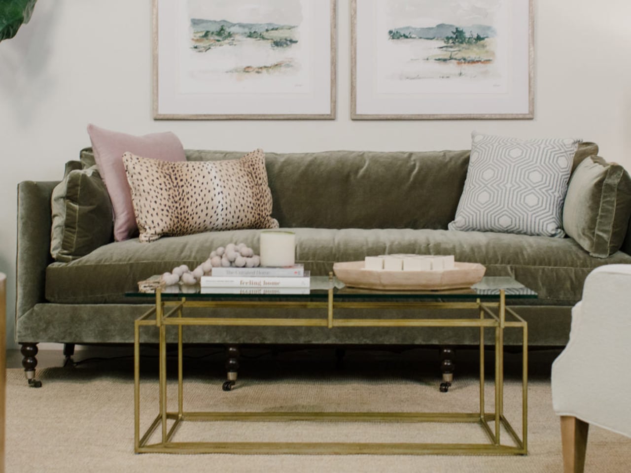
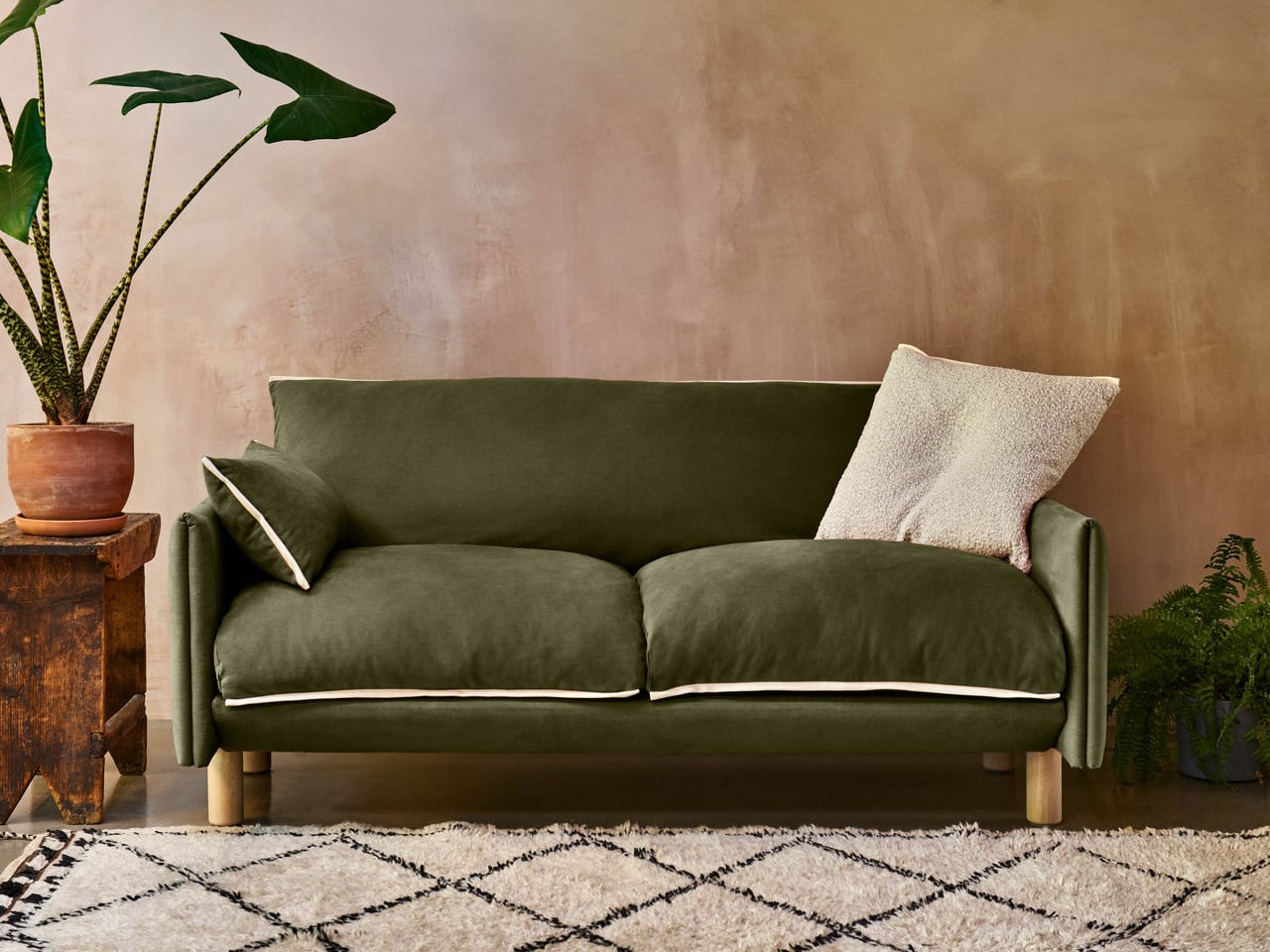
The green revolution goes way beyond trendy sage walls. Designers are using moss, olive, eucalyptus, and forest tones in upholstery because green has measurable calming effects on the nervous system. But here’s the key: they’re choosing muted, complex greens that reference nature, not the artificial brights that dominated previous trends. These colors work because they connect us to biophilic design principles that our brains instinctively recognize as safe and comfortable.
The Six Colors Designers Won’t Touch Anymore
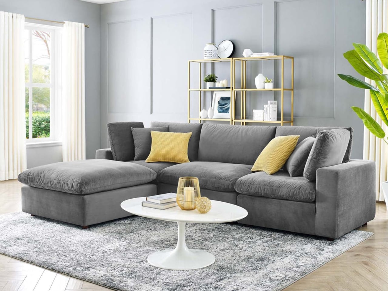
Cool gray is officially dead. I mean completely, totally, irreversibly dead. This non-color dominated for a decade because it seemed safe, but designers now know it reads as emotionally cold and physically chilling. Studies show cool gray furniture makes rooms feel 2-3 degrees colder, forcing people to crank up their heat. West Elm and CB2 are phasing out their gray lines so fast it’s like watching a fire sale.
Stark white sofas have become the ultimate red flag for design immaturity. Any designer specifying pure white upholstery in 2025 is essentially admitting they care more about Instagram than their client’s actual life. The maintenance anxiety, the glare issues, and the way white creates psychological distance between family members all add up to a color that actively works against comfortable living. 
Charcoal gray might seem sophisticated, but it’s a light-sucking vampire. Designers have the data: dark gray furniture increases the need for artificial lighting by 50% and makes rooms feel significantly smaller. One designer told me she won’t even show charcoal options anymore because “it’s like recommending depression as a design choice.”

Navy blue exhausted itself through sheer overuse. What once felt classic now feels like the furniture equivalent of a Brooks Brothers uniform. Designers report that navy ages terribly in perception, making spaces feel dated within two years. The color is too formal, too heavy, and too associated with a specific preppy aesthetic that feels increasingly out of touch.

Bright aqua is the pandemic’s most regrettable design legacy. Designers call it “lockdown blue” and actively steer clients away from high-saturation brights. Visual fatigue is real: Studies show bright aqua causes 40% more rapid eye movement than neutral tones, literally exhausting your brain just by existing in your peripheral vision.
Millennial pink refuses to die, but designers are done pretending it’s acceptable. One high-end designer in LA told me she charges a “pink tax” surcharge if clients insist on it, because she knows they’ll want it changed within 18 months. The resale value data is brutal: pink furniture loses 60-70% of its value, the worst of any color.
Why This Color Revolution Actually Matters
The warm neutral takeover isn’t arbitrary. Colors like Article’s cognac leather and Crate & Barrel’s greige options contain undertones that align with our circadian rhythms. They make spaces feel warmer without touching the thermostat, promote better sleep, and age beautifully rather than showing every sign of wear. But this goes way beyond swapping one trend for another. Designers are fundamentally rethinking how color functions in living spaces, prioritizing psychological comfort over photogenic appeal, long-term satisfaction over short-term impact.
Material innovation drives many of these new color choices. Sustainable fabrics often come in warmer, more natural tones by default. Undyed linens, vegetable-tanned leathers, and recycled fibers bring their own color stories that happen to align perfectly with what designers want. The intersection of sustainability and aesthetics isn’t coincidental; it represents authentic materials showing their true colors. These materials age gracefully, hide wear naturally, and support rather than stress their owners.
The psychology runs deeper than aesthetics. Earth tones exist abundantly in nature, so our brains process them as fundamentally safe and comfortable. Designers are essentially hacking human evolution, choosing colors that trigger the same calm responses our ancestors felt in natural shelters. The data backs every choice: warm neutrals reduce reported stress levels, earth tones improve sleep quality, natural greens lower blood pressure. These aren’t aesthetic preferences; they’re evidence-based design decisions working with 200,000 years of human development.
Smart designers know something fundamental has shifted. We’re done with furniture as performance art. The new palette reflects furniture as life support, colors that actively contribute to well-being rather than just looking good in photos. Designers are thinking in decades now, not seasons, choosing colors their clients will still love in ten years, that will develop character rather than show damage. If your sofa color isn’t making your life better, it’s making it worse. And in 2025, designers simply won’t specify colors that work against human happiness. The revolution isn’t coming; it’s here, and it’s warm, earthy, and actually designed for living.
Vincent Nguyen
If you liked the article, do not forget to share it with your friends. Follow us on Google News too, click on the star and choose us from your favorites.
If you want to read more like this article, you can visit our Technology category.