Minimal smartwatch concept challenges wearable design status quo

Although it took some time, smartwatches have finally found their true calling as health-centric wearables that also provide access to voice-activated AI assistants. But while the technologies inside them have advanced through the years, their external designs seem to have stagnated. They’re all beginning to look the same and, for better or worse, are stumbling over trying to look like regular watches.
Smartwatches still need to be able to tell the time, of course, but there’s no requirement that they should have those classic circular or square designs. That might appeal to some people, but even the analog and digital watch markets are teeming with unconventional shapes and appearances. This smartwatch concept tries to think outside the box by delivering a minimal design that only focuses on the essential experiences.
Designer: Ibrahem Hassan
Smartwatches adopted traditional watch designs back in the day when people felt unfamiliar and uncomfortable with the idea of miniature smartphones on their wrists. Today, everyone knows what a smartwatch is and its features, and few of those benefits actually have anything to do with telling the time. And if you consider some of the more eccentric and more expensive watch designs in the market, you’ll realize it might also be time for smartwatches to outgrow their roots.

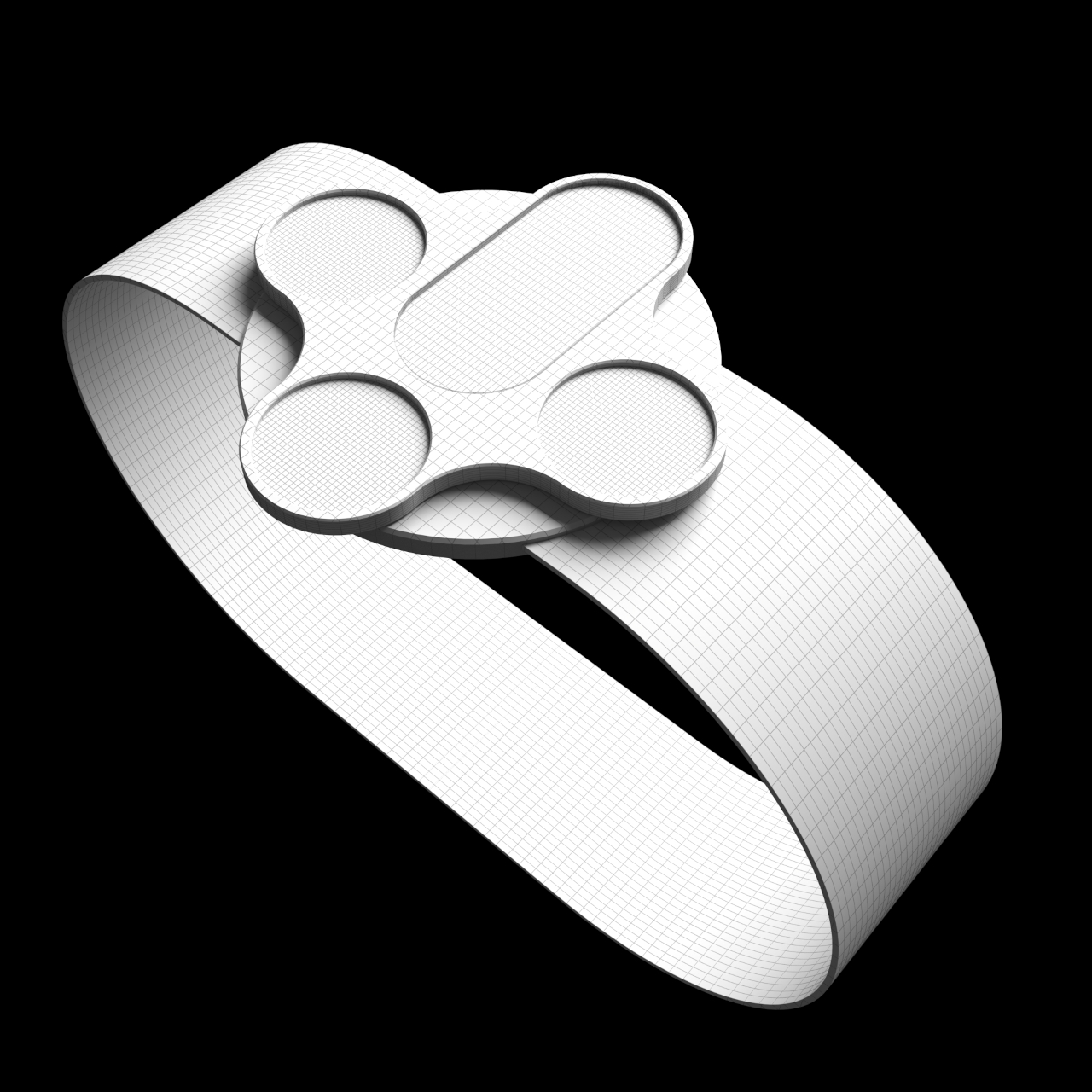
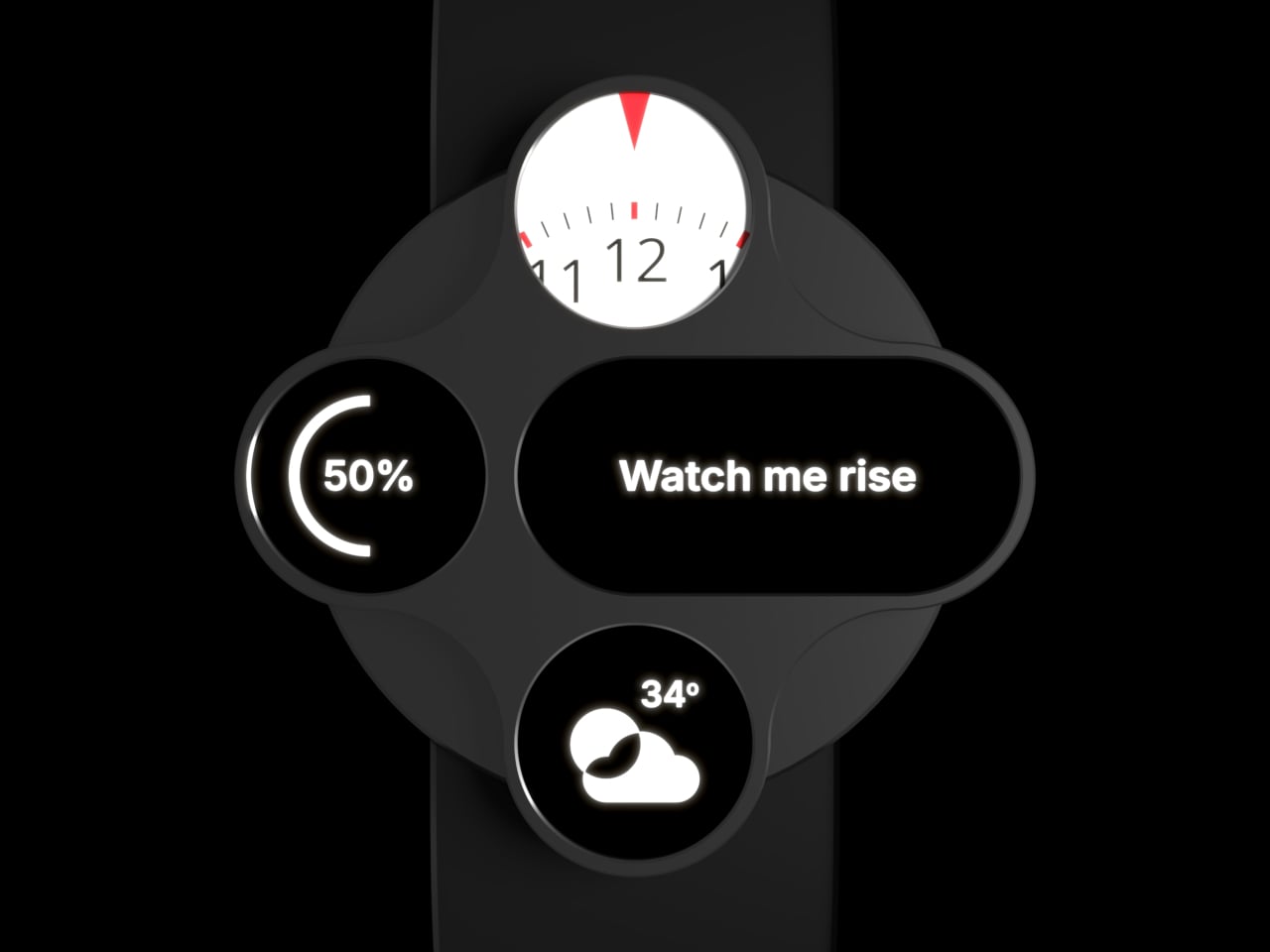
The Minimal Watch Concept distills the design of the smartwatch down to its most basic features, with time actually taking only a secondary role. Instead of a full circular display, it has four separate displays spread in a cross-shaped arrangement. Each of the displays has a distinct role to play, and only the top circular screen actually tells the time in a speedometer-like representation.

The middle row, composed of circular and wider pill-shaped screens, is the main area that shows the current action or activity running. The larger screen displays content like messages, alarms, tasks, or caller IDs, while the circular screen beside it shows related information such as the activity icon, the caller’s photo or avatar, and more. The bottom circle display can display other information or actions, whether they’re related to the current activity, such as an icon for accepting or ending calls, the current temperature, or a record button.

Admittedly, such a minimal design actually complicates the implementation by splitting a single display into four screens. Such changes could have consequences for battery life, software complexity, and user experience. At the same time, however, it also reduces the potential for distractions or unnecessary apps by limiting the usable space. At the very least, the Minimal Watch Concept dares to imagine a design that eschews tradition and explores new ways to interact with wearable devices.
JC Torres
If you liked the article, do not forget to share it with your friends. Follow us on Google News too, click on the star and choose us from your favorites.
If you want to read more like this article, you can visit our Technology category.


