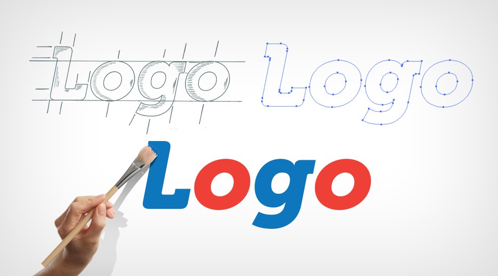
#Top 8 Reasons Why Your Logo Design Looks Boring
Your brand logo design speaks a lot. Keeping your logos trendy, catchy, and intense would be best. They should also properly represent your theme.

Table of Contents
Top 8 Reasons Why Your Logo Design Looks Boring
Logo designs are the basic identity of your business, so make sure they represent your company. It isn’t easy to just make up a sign and give your brand name to it. Thus, you have to look for a logo designer who knows how to say a lot through just a symbol!
Top 8 Reasons Your Logo Design Looks Boring
#1) Brand Names Are Important!
Today’s market is quite competitive, and a good logo is the first step to grabbing a consumer’s attention. However, it is a common mistake when designing logos to leave your brand’s name unmentioned.
By this, not only the very basic identity of the brand is lost, but the company may also fail to make it remembered by the audience. Instead, logos that carry brand names have a slightly intense effect on minds causing them to remember the brand.
If you don’t want to stay out of the light, ensure your logo designer (for instance, logo design services) puts the brand name in.
#2) Unique Selling Point
The only way to pave a smooth channel alongside competitors is to focus on making your brand different from others. Some logos follow the patterns and structure of previous logos of various companies.
This causes doubt among the customers and develops a feeling of copied ideas being used. The audience relies little on such a brand to launch new and unique products when it has failed to design a specific identity.
Ignorance of this fact causes many businesses to redesign their logos later, as done by USA Today
#3) Obsolete Advertisement
The effectiveness of your logo to communicate depends on where you get the inspiration from to design that logo. Being stuck in the old ideas does not appeal to the customers as they are looking for something different and new.
So when designing a logo, you should use advanced methods of visuals and graphics. A logo based on the 90s or 2010s techniques isn’t of any use. Such obsolete trends may make your logo design look boring.
#4) Communication with Clarity!
Besides your logo being catchy to the eye, it must also serve as a precise and meaningful introduction to your brand. For this, there should be some text included in your logo that calls on the customers a ‘hook.’
Such a tagline would define your brand’s purpose so that it is not misunderstood but instead serve as a great option to potential customers.
#5) Latest Trends in The Market
It is a common phenomenon that your logo should follow the current trend. However, sticking to the trends may steal uniqueness. It can cause your logo to seem boring and not subjective to a customer.
The fundamental focus is on modeling a symbol that allows your brand to speak to customers rather than showcasing present logo trends in the market.
#6) Over elaborative structure
Your logo should summaries your brand in a very directive tone. Extra or unnecessary letters/designs will make it look too mixed up. This may not be very clear to customers. A good logo is always easy to interpret.
Remember, keep your logo design nice and simple if you don’t want to make your logo design look boring.
#7) Fancy or Disturbing?
The correct choice of color for your brand logo is very crucial. The colors used in the logo speak about the nature of your brand. Since color can create a psychological impact on your customers, you must take care not to add too many bright colors altogether.
#8) Learn Before You Delegate
Your Logo designer should know what he has to do. Instead of just explaining the directions, ensure you learn the techniques you’re talking about. This tip will help eliminate the possibility of your logo design looking boring.
Some basic techniques in the art of logo design include leaving some space to make your logo look clean. Others such as Line Art Gradient Mesh will also help you work like a professional.
Conclusion:
Now that you know the creative techniques necessary to make logos attractive, go on! Impress your target audience and spread your monogram around the market.
by Ellie Singh
If you liked the article, do not forget to share it with your friends. Follow us on Google News too, click on the star and choose us from your favorites.
For forums sites go to Forum.BuradaBiliyorum.Com
If you want to read more Like this articles, you can visit our Social Media category.


