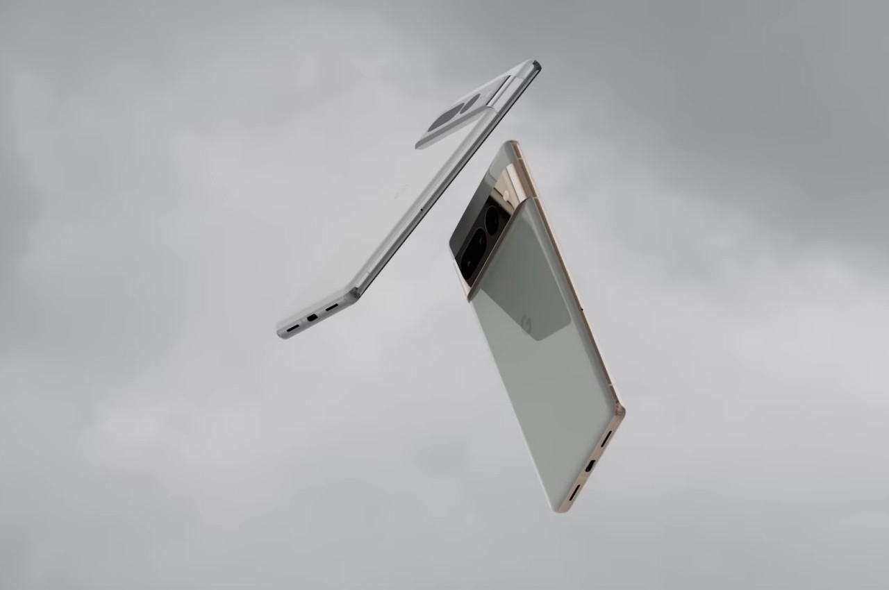
#Pixel 7 and Pixel 7 Pro design aims for a smoother and more sophisticated look

Table of Contents
“Pixel 7 and Pixel 7 Pro design aims for a smoother and more sophisticated look”
Smartphones have started to sound and even look similar, not only from their specs but also from their designs. That’s why many manufacturers are now trying to stand out from the crowd with a new design almost every year. Some are tasteful and elegant, while others can be obnoxious and over the top. Some, on the other hand, have tried to go against the flow and stick a design until it gets long in the tooth. After many generations, Google finally decided to give its Pixel phone a fresh new face last year with some amount of success. Rather than switch to a different design after that, the Android maker has instead opted to refine a winning formula, making it look a bit more grown-up rather than a passing teenage fad.
Designer: Google
![]()
![]()
There might be some people who disagree with the aesthetic of last year’s Pixel 6 siblings, but few will argue that it at least had some lasting impact. It was so unlike any other smartphone on the market, and the shape of its visor-like camera bump, paired with its dual-tone color scheme, made it look novel, quirky, and youthful. Just like the Material You design language of Android 12 from last year, it carried some character that would appeal to people who see their smartphones as a form of personal expression.
![]()
![]()
Wow factors rarely last forever, though, and the Pixel 6’s design might even look too playful for some people. Rather than throw it away, Google is maturing the easily distinguishable design instead, making the Pixel 7 look more mature and well thought out. The differences are subtle yet telling, retaining the Pixel’s new visual identity while also giving it a more sophisticated character compared to the youthful Pixel 6.
![]()
![]()
The camera bar, for example, not only protrudes less but also blends visually and structurally with the frame. It now shares the same color as the mid-frame rather than just a black paint job. As for colors, the back of the Pixel now has a single color, and the camera bump provides not only visual but also a chromatic that makes that side of the phone look more active. The cameras themselves are also displayed better, huddled into groups rather than standing isolated from each other.
![]()
There are still parts of the design that remain the same, particularly when comparing the Pixel 7 and the Pixel 7 Pro. The former, for example, retains its flat display, while the Pixel 7 Pro sticks to its curved edges. In both cases, the two still bear hallmarks of a slightly older design convention that uses rounded edges to supposedly make the phone comfortable to hold. Not everyone’s a fan, though, but it at least fits perfectly with the Pixel 7’s design.
![]()
![]()
It’s definitely refreshing to see that Google hasn’t given up on a design that gives its phone a distinctive appearance. Even better, it is actually improving that design to make it look more elegant while still retaining its quirky nature. Of course, a phone is more than just its looks, and we’ll have to see next month whether the combination of design and hardware will put the Pixel 7 at the top this year.
![]()
![]()
![]()
![]()
JC Torres
If you liked the article, do not forget to share it with your friends. Follow us on Google News too, click on the star and choose us from your favorites.
For forums sites go to Forum.BuradaBiliyorum.Com
If you want to read more like this article, you can visit our Technology category.


