#Kehai wall clock makes you look at the passage of time in a different light
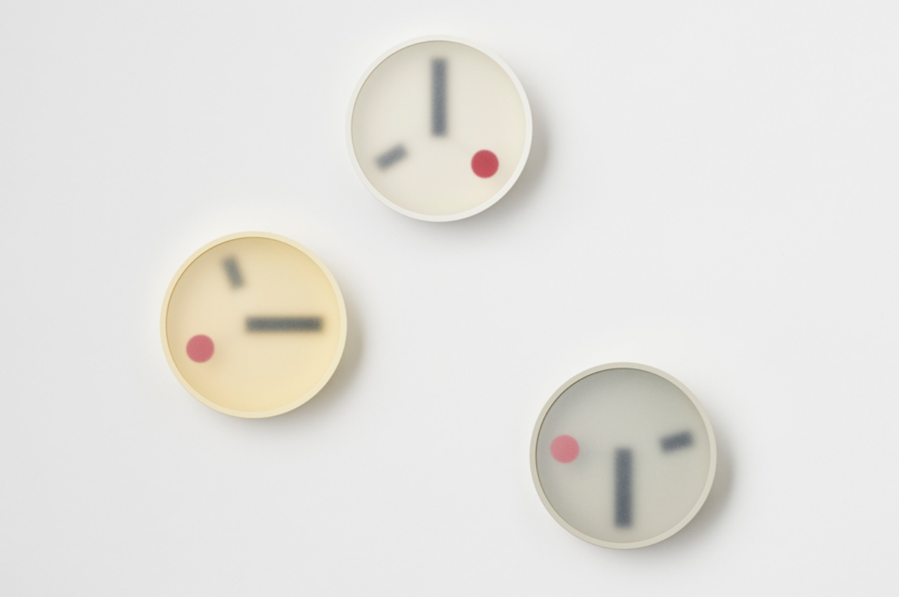
Table of Contents
“Kehai wall clock makes you look at the passage of time in a different light”

Being able to tell the time of day may have been critical to survival in ancient times, but our modern lifestyles have unsurprisingly put a different twist on that. More often than not, the ticking of the clock, literal or figurative, is a source of stress for some people, a glaring reminder of how little time they have left in the day or in their lives. Minimalist clocks have tried to change our attitude towards time by changing the way we look at clocks themselves. This wall clock continues that tradition by applying a good measure of Japanese minimalist aesthetic to create a timepiece that tries to make you feel more detached from the burden of keeping time.
Designer: Makoto Koizumi
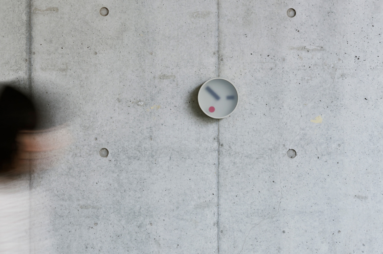
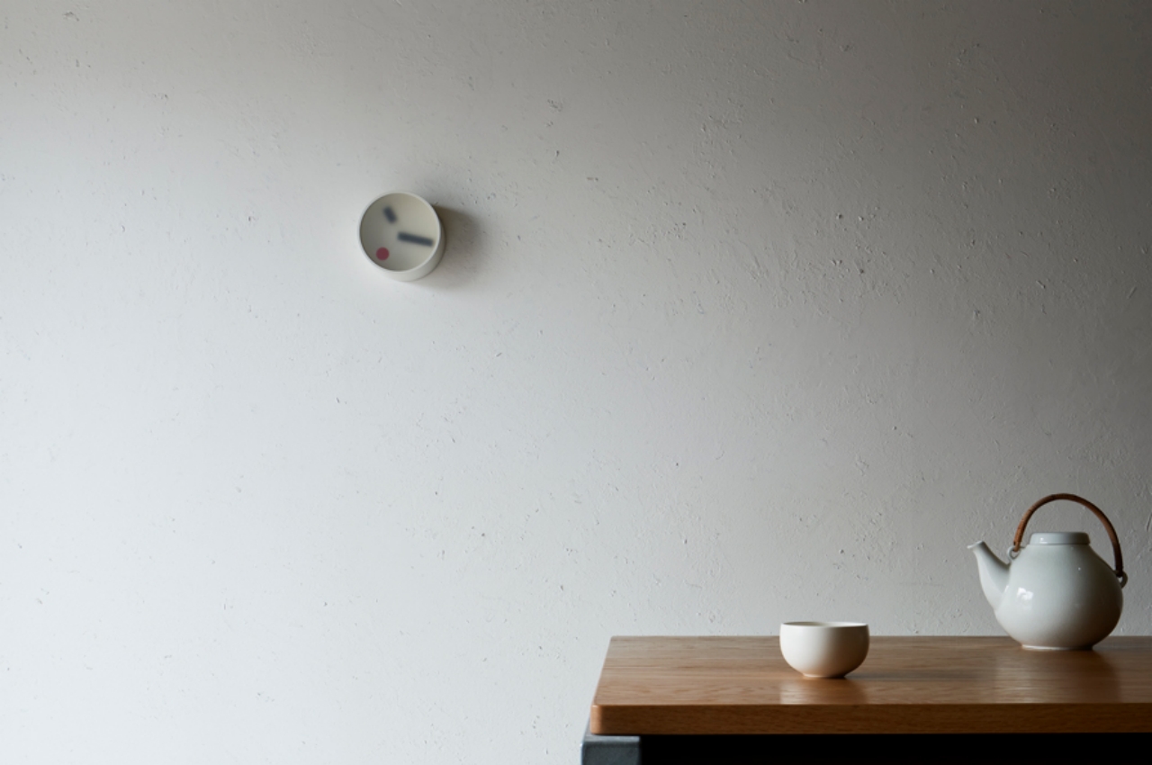
It starts with the very shape of the clock, a simple and familiar circle. The custom aluminum frame is made in Japan using a casting technique to create a thin yet durable container for the wall clock. Available in white, yellow, and gray, the clock almost disappears into the wall if placed on a surface that nearly has the same hue. Without any extraneous marks inside or outside, the minimalist appearance of the clock’s frame tries to avoid inducing stress whenever you look at it.
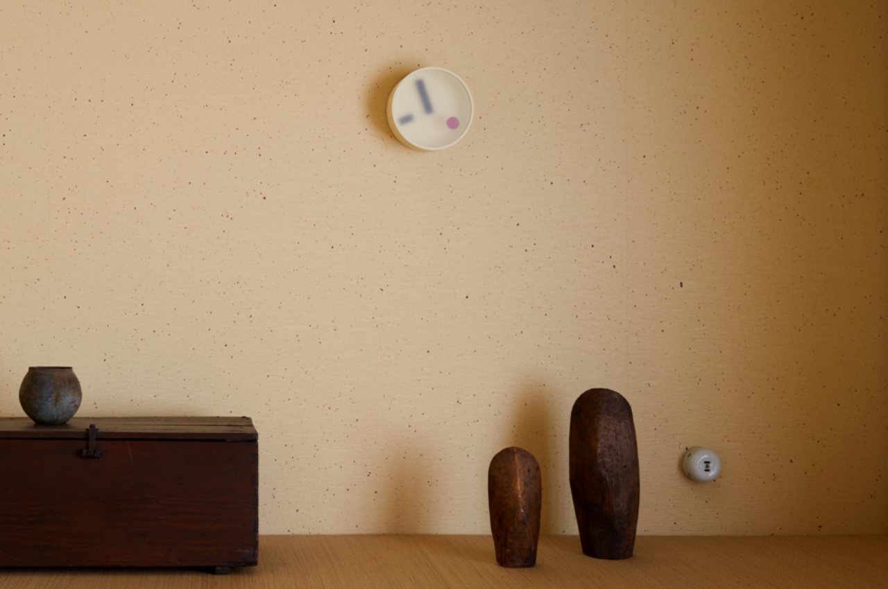
The clock’s hour and minute hands are not only plain, but they’re also literally flat and look almost broken. The two together almost give the clock a skewed face, as if the hands were floating in some murky soup of time and space. The frosted glass on top adds to the obscurity of the hands and the clock in general as if making it harder to read the time. Its ambiguous design, as the designer called it, tries to make us rethink our sometimes unpleasant view of time and the clocks that represent them.
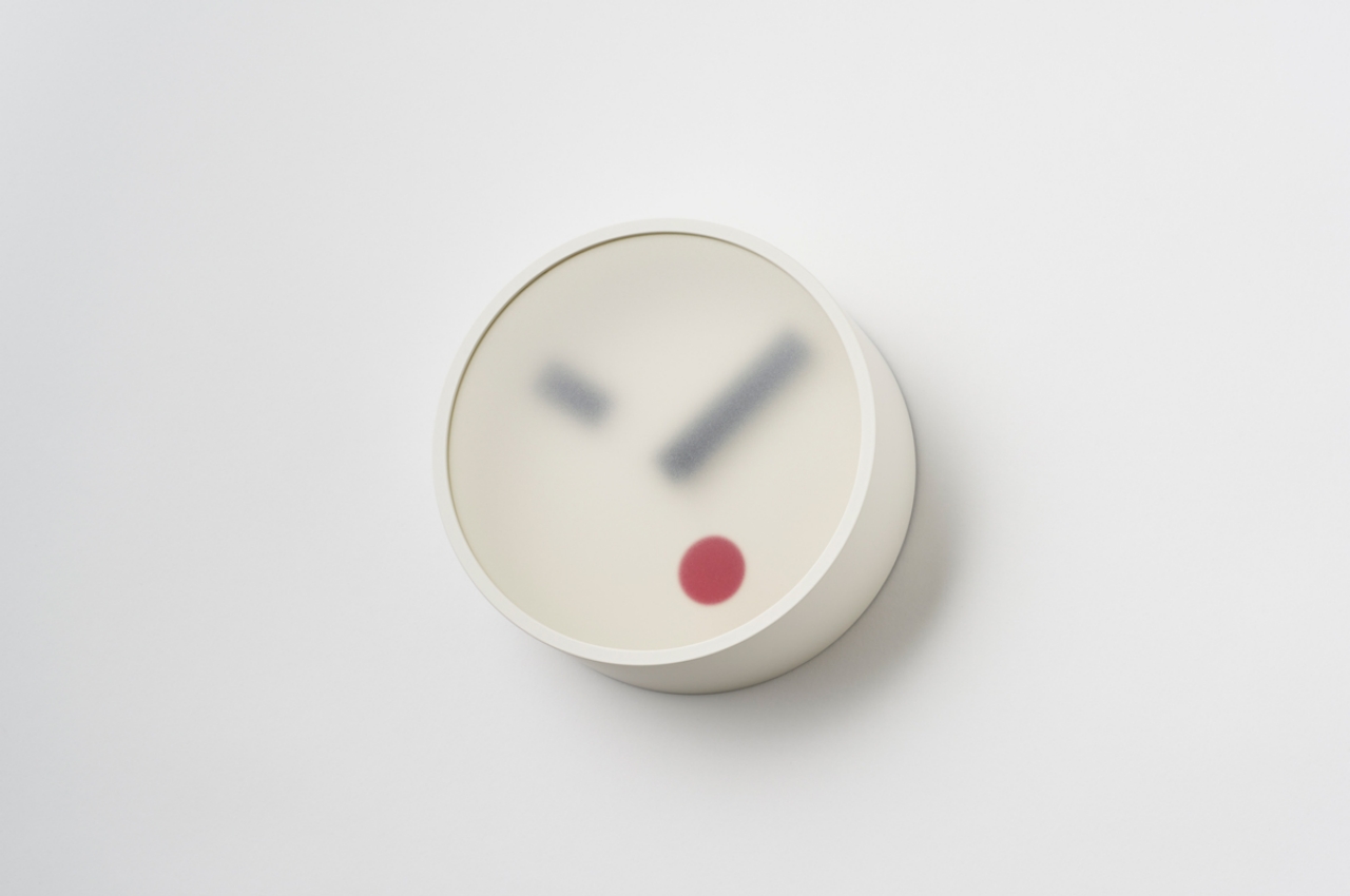
In contrast to the rest of the clock, however, the second “hand” easily stands out and calls attention to itself. It’s just a big red dot that looks almost like a zit on the clock’s otherwise pristine face. It is so unlike traditional seconds hands, not just in appearance but also in movement. Where most hands move either in staggered motions or sweep swiftly around, the size of the red circle means it travels smoothly and more slowly as it circumnavigates the clock’s edge. In some sense, it removes the tension when watching the Kehai clock, unlike the gripping suspense of watching the second hand hit 12 as seen on TV.
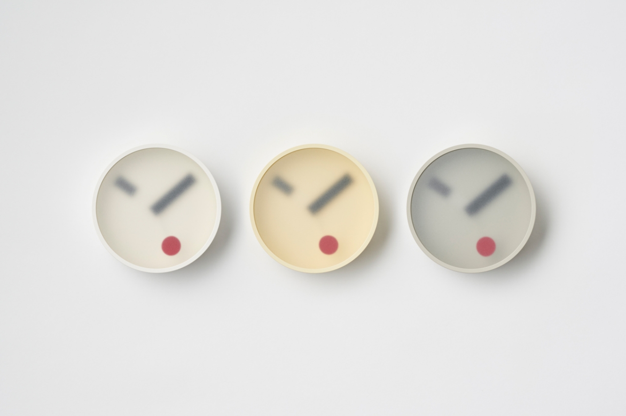
Kehai is a simple and beautiful interpretation of a clock that is both Zen and playful at the same time. In a way, it almost represents that same ambiguity we have towards clocks and time itself. The murky glass is seemingly creating a barrier between us and the clock, while the red dot tries to remind us that every second counts. Time passes at the same rate, whether we rush or not, and this clock tries to blur our skewed perception of it while also giving any wall and any room a unique character.
JC Torres
If you liked the article, do not forget to share it with your friends. Follow us on Google News too, click on the star and choose us from your favorites.
For forums sites go to Forum.BuradaBiliyorum.Com
If you want to read more like this article, you can visit our Technology category.


