#Pixel 6a and Pixel 7 cement Google’s design language

Table of Contents
“Pixel 6a and Pixel 7 cement Google’s design language”
The smartphone market is often characterized as fast-paced, frantic, and whimsical, with features and designs getting changed almost every year. While that helps keep products look fresh and allows companies to experiment with new ideas faster, it also makes it difficult for people to form familiarity and confidence in these products. Apple is the lone exception, as always, and sticks to its designs longer to build brand loyalty. Other manufacturers have started to realize the wisdom of staying put, even just for two generations or three, especially when they come across a design style that uniquely works for them. That seems to be the case with Google’s latest generation of Pixel devices, establishing what will hopefully be Google’s signature look until 2024 at least.
Designer: Google
![]()
![]()
Even before Google launched the Pixel 6 last year, the designs that were leaked already sparked interest and praise across the Interwebs. The form was unique, non-conformist, and quirky, traits that could be used to describe Google or at least Google in its youth. Just like the first Google Pixel phone, the new Pixel 6 design exuded a more humane and approachable appearance that belied that hard power that is crammed inside the phone.
![]()
![]()
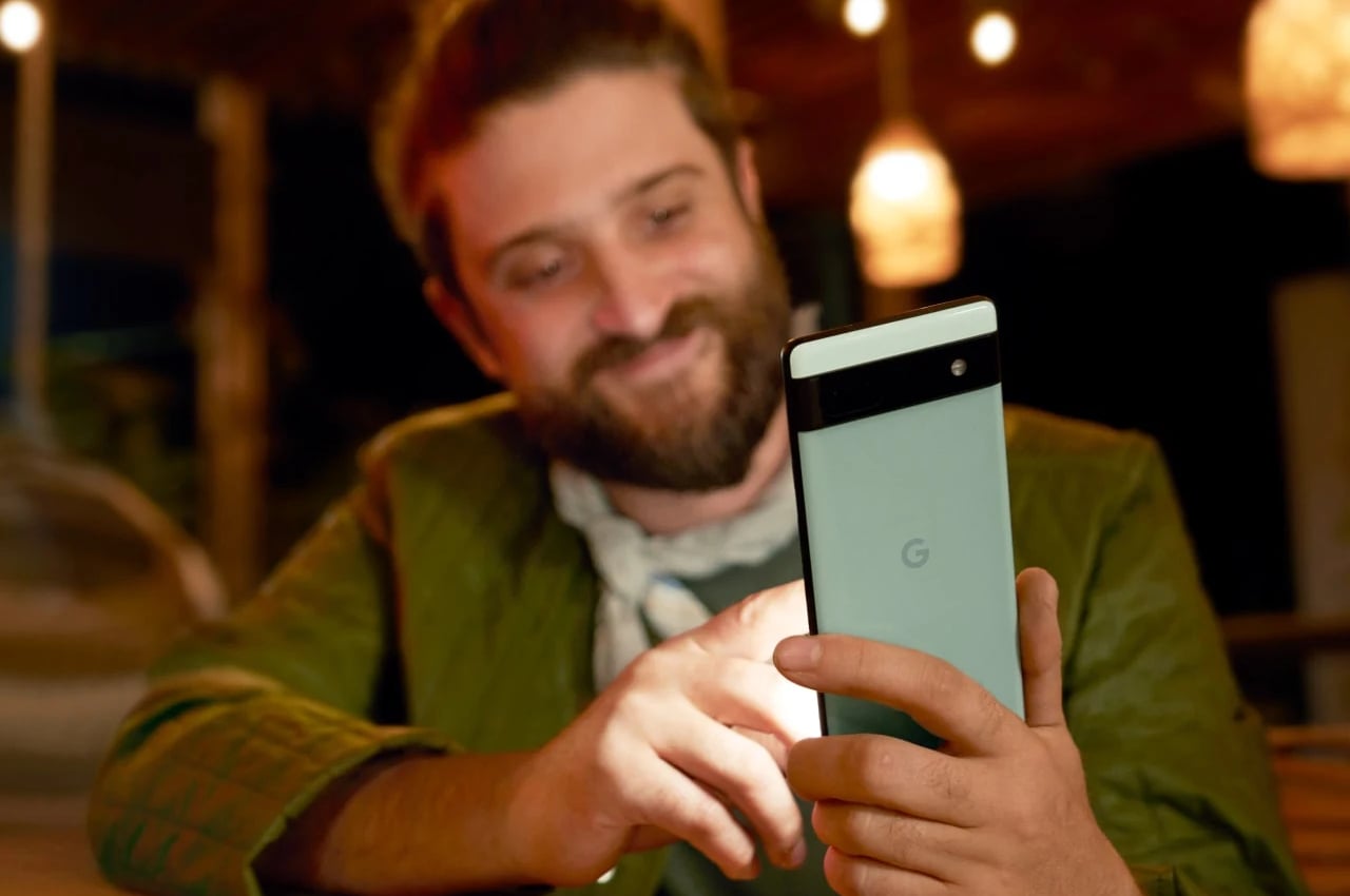
The Pixel 6 continues this aesthetic with almost no modification. It has the exact same visor-like camera bump and dual-tone color split. The only difference, which most people might not know, is that the camera bump is always black, no matter the colorway you pick. More importantly, however, the Pixel 6a also partakes in most of the same hardware, particularly the Tensor processor, that the Pixel 6 and Pixel 6 Pro use at a more approachable $449 price tag.
![]()
![]()
Perhaps trying to beach leaks to the punch, Google uncharacteristically also revealed the design of the Pixel 7, which looks a lot like the Pixel 6 and 6 Pro, too. There are more visible differences now, with the camera lenses visibly separate from the rest of the camera bump and a more uniform color scheme. Despite those modifications, it’s not hard to pick out the Pixel 7 from a lineup, at least if it’s face down and showing its unique back.
![]()
![]()
![]()
![]()
The Pixel Buds Pro does deviate a bit from Google’s earbuds design for the past year or so. Whereas the Pixel Buds 2 and Pixel Buds A both sport “wings” to aid in fitting the buds into ears, the Pixel Buds Pro’s shell is more streamlined and more refined. Just like their predecessors, the buds come with a vertically oriented charging case, and just like their predecessors, it carries a dual-tone color scheme. All color options have a black body and differ only in the outer touch surface.
![]()
![]()
Google is clearly aiming for a more consistent and more identifiable branding with its latest products, and hopefully, that will continue to be the case even after the Pixel 7 launches later this year. The one outlier, however, seems to be the still-unnamed Pixel tablet that will launch in 2023, though there’s hope that Google will change directions before then. A bit more interesting will be the Pixel Watch, Google’s first-ever first-party smartwatch, with a design that some have already mocked as a “round Apple Watch.” It does fit in with Google’s use of smooth, curved surfaces and the duality of colors and materials, but we’ll have to wait until Fall to see who it plays in practice.
![]()
![]()
![]()
![]()
![]()
![]()
![]()
JC Torres
If you liked the article, do not forget to share it with your friends. Follow us on Google News too, click on the star and choose us from your favorites.
For forums sites go to Forum.BuradaBiliyorum.Com
If you want to read more like this article, you can visit our Technology category.


